
Friday, 18 November 2011
Wednesday, 16 November 2011
Evaluation: Who would be the audience for your media product?
The Target audience for my music magazine would be alternative music fans who are young (14-25). The reason I have chosen this group is because the content of the magazine features young acts who are in their early twenties upwards.
 I have chosen the content carefully to suit this audience by featureing content like the Adele album review as Adele is a young artist, and a ticket competition for reading and leeds festivals which is an event, popular among the target audince of the magazine.
The use of Gaze theory is also important to the target audince. my photography features younger people because the target audince would not be attracted to photos of older people.

The use of Gaze theory is also important to the target audince. my photography features younger people because the target audince would not be attracted to photos of older people.
Evaluation: Looking back at your preliminary task, what do you feel you have learnt in the progression from it to the full product?
From My preliminary task to the main task I learned a great deal to do with time management, photography and Layout.
The first thing I learnt was about time management which I felt was the weakest area in my preliminary task which was rushed in some aspects. For example I spent a large amount of time researching front covers an worked less on contents page research. Which meant that my contents page production for the preliminary task was not as good. I rectified this for my main task by spreading my time between all aspects of my production which shows in the progress from my preliminary task contents page, to my main task contents page.
With the production of both tasks I felt that my time management was bad and I would improve this if I was to do this again.
Another area I learned a great deal about is photography. In my preliminary task I only had one good photo to use which made my production very poor. I improved this in my main production as I had two photoshoots that allowed me to take a large amount of images that gave me a huge amount to choose from to make my main task the best it can be. when taking photos I also learned about composing shots better as in my preliminary task I did not give space in the photos for the production of a magazine around it. I learned from this and for my main production I left space for construction elements like the Masthead, Lures and the article.
The last area I felt I improved on through my tasks was the Layouts of my page which I improved on a huge amount. For example, my contents page layout in the most drastically changed from preliminary to full product. this is because of greater care in research and production was taken by me to get the layout right this time, I used a categorised contents and different sections to eliminated dead space and create a professional looking product.
Evaluation: What have you learnt about technologies from the process of constructing this product?
During the project i used Adobe Creative Suite 3 where I used Photoshop Cs3 and Illustrator Cs3 (Screenshot Bellow).

I have had experience using both these programmes in GCSE so have previously produced work. I feel like I used this experience to produce my magazine more quickly and easily. However I did learn some thing through the construction of this product particularly with using text in illustrator. where I have learned how to wrap text like is shown in the video bellow.
I have also used new technology to research and develop my product in the form of Blogger which I have used to post all aspects of my project for research, drafting, development and evaluation. This was completely new as I have never used a blog before, however I am used to using the internet and use it for work and free time. Blogger was easy to get used to as I understand most of the functions that are used in Blogger already from using Facebook and Twitter of which blogger is similar the difference being that for the purpose of this media blog the address is more formal.
Evaluation: How did you attract/address your audience?
To attract my audience I had to use the codes and conventions of magazines mixed with the right colours and photography.
 The first thing I used was the colour scheme which was important in attracting the audience. the bright yellow and red colours that I have used demand attention which is why I have used them over the other, darker, colours the I drafted. This is because the bright colours stand out against the darker ones that the magazine may sit along side. However there may be other similarly coloured magazines about so other tools must be used to make the image stand out.
The Photography and composition of the key image on the front cover is very important to attract the audience. I have selected an image for my front cover that is a large attractive shot of the two artists. I have tried to apply media theories to attract the audience in this shot by using Gaze theory where readers will be attracted by the people on the cover, the idea being that men wish to be like the men on the cover and girls want men that are on the cover. The effect this has is attracting readers to look at the magazine on the shelf.
 The Photo also covers part of the Masthead meaning that attention is drawn from Masthead to Key Image and Viceversa.
 The first thing I used was the colour scheme which was important in attracting the audience. the bright yellow and red colours that I have used demand attention which is why I have used them over the other, darker, colours the I drafted. This is because the bright colours stand out against the darker ones that the magazine may sit along side. However there may be other similarly coloured magazines about so other tools must be used to make the image stand out.
The Photography and composition of the key image on the front cover is very important to attract the audience. I have selected an image for my front cover that is a large attractive shot of the two artists. I have tried to apply media theories to attract the audience in this shot by using Gaze theory where readers will be attracted by the people on the cover, the idea being that men wish to be like the men on the cover and girls want men that are on the cover. The effect this has is attracting readers to look at the magazine on the shelf.

Evaluation: What kind of media institution might distribute your media product and why?
The Most Common stockist of my music magazine would be small shops, Music stores and supermarkets as these are the most common stockists of music magazines of all genres as well as newspapers and publications from other areas in the media such as driving magazines and fashion magazines. This is why the cover must be eye catching as there are many competitors that will be considered by the customers.
There are other places where the magazine my be sold via other media platforms. For example on the app store for iPhone where the newsstand app makes thousands of publications available for digital subscription. This is an example of new media technology is being used to supply media to customers and shows how media institutions, such as the ones that publish magazines, have to diversify in order for sales to continue.
There are other places where the magazine my be sold via other media platforms. For example on the app store for iPhone where the newsstand app makes thousands of publications available for digital subscription. This is an example of new media technology is being used to supply media to customers and shows how media institutions, such as the ones that publish magazines, have to diversify in order for sales to continue.
Evaluation: How does your media product represent particular social groups?
The social groups that I am trying to represent with my magazine are young people who are interested in magazines about indie and alternative music. This group are people who would read magazines such as NME and Q Magazine. Young people are usually students so have a lower income as many may be at university.
This demographic is targeted by using images of younger artists who are of a similar age to the demographic. Also the content of the magazine such as gigs and festivals are of interst to the target group as these events are popular among younger people who go to them more often.
This demographic is targeted by using images of younger artists who are of a similar age to the demographic. Also the content of the magazine such as gigs and festivals are of interst to the target group as these events are popular among younger people who go to them more often.
Evaluation: In what ways does your media product use, develop or challenge forms and conventions of real media products?
Through my Preliminary and Main tasks i have conformed to most conventions of magazines. I have used a masthead, lures, a bar code and issue information, categories like features and monthly in the contents page. The reason I have conformed to conventions is because the conventions that are used by magazines are tried and tested, they work and achieve the purpose of a magazine, which is to attract a readers attention so conforming to them means that my magazine should attract attention and potentially sell.

I have also used iconography related to the genre like the photo of the guitarist on the contents page (Right). which shows the fashion and instruments, which are iconic in the genre of music that my magazine covers.
In some areas however I have challenged the conventions of magazines like in my preliminary task where I did not use a bar code on the magazine which is an important convention as it is necessary for the magazine to be sold. The reason for not using this convention is because my research shown that magazines of this kind do not need a bar code as they are not sold, they are given out. The main front cover that I used for research (Found here) challenged a lot of convention with the bar code not featuring. As seen in the website, the magazine can be downloaded not bought so the bar code is unnecessary.
Monday, 14 November 2011
Double Page Development and Final Analysis
This is the Progress of my double page spread to the final piece.
Version 1:

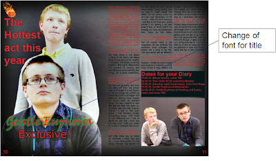
This is the first version which includes the important elements of a double page spread that are used to catch the readers eye. Things like the huge key image that takes over the whole first page, the bold first line that stands the article out, the inset images, and the bold glowing title. The problem here is to do with the poor variety of font.
Version 2:

Version 1:

This is the first version which includes the important elements of a double page spread that are used to catch the readers eye. Things like the huge key image that takes over the whole first page, the bold first line that stands the article out, the inset images, and the bold glowing title. The problem here is to do with the poor variety of font.
Version 2:

The Second version of the double page spread gives a change in the font variety which involves bringing the font used to advertise the article on the front cover to the article. This is good as it gives a continuity from the cover to the article.
Version 3: Final

On the final version I added a line to end the article and I drew the photo back so that the page with text was white. To add the ending line I edited the text, I closed the lines together which made a more professional look and created space for more features.
This page is probably the best of my production however the photography could have been better and I could have used a greater variety of images.
Contents Development and Final Analysis
This is the analysis of the development of my final Contents page.
Version 1:


Version 1:
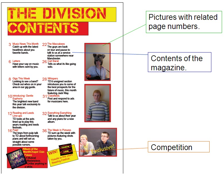
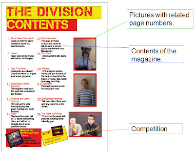
The First contents page is quite bad. it shows some of the conventions like Competition sections and pictures with related page numbers. However it lacked a categorised contents and had a huge amount of dead space. This will begin to be corrected in version 2.
Version 2:

This version has smaller text in the story lines allowing space for more features, the problem was these features were not added and an increase in the the problem of dead space has come about.
Version 3: Final

This version saw the dead space filled which has meant that the page looks more professional and eye-catching. I have shown more conventions like the categorised contents and I have added features like the Subscription, Review and Website sections. This is the best version and shows the most conventions.
For the contents page I could have done better as the section feels rushed and defiantly the weakest of my areas. more time in planning and development was needed here.
Front Cover Development and Final Analysis
This is the Development and final version of my front cover.
Version 1:


Version 1:
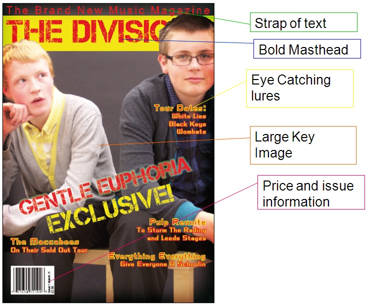
It Contains all of the codes and conventions from my research like Masthead, lures, barrcode and issue information. The problems are
Version 2:

This version involved rearranging the lures on the page to make space for a band list at the bottom which is another convention that can be seen in existing products. I have also varied the font for the main lure to create a more interesting look for the page.
Version 3: Final

The final edit saw the stroke removed as it improved the clarity of the text.
I think I could have improved my photography which is one of my weaker points as i had to have a re shoot and even after that some of my pictures could not be used. The improvement of my photos would have meant an overall better final piece as the cover would have been made more eye catching.
Saturday, 12 November 2011
Drafting
Using my research I have created drafts for each section.
Front cover:
1 2 3

My draft work uses all the conventions of magazines like the strap of text across the top of the page, the masthead and lures described in my research and the large, eye-catching key image. I will use Draft 3 as the colours work better and was preferred by people who looked at them.
Contents:
1 2 3

These are my contents drafts and the also conform to most of the codes and conventions of magazine contents pages. They have the contents of the magazine, images with page number and competitions. However none feature categorised sections which i will need to incorporate in my actual production so I conform to the codes and conventions of magazine contents pages.
The Draft I will use is 1 as it matches the colours of the chosen front cover, however I will use elements from the others like the album of the month section (Draft 2) as this will create a better contents page with more conventions.
Double Page Spread:
1 2

3
This is the draft work for my double page spread. They all contain large images that attract attention like what is shown in my research, they have "Exclusive" tags (Except 1) which will catch readers attention and have bright titles that also draw people to the article. I will be using draft 2 as the mid shot of the band was popular, the exclusive tag features and the "TD" fireball in the corner features which has a connotation of a "Hot" new popular act.
Wednesday, 9 November 2011
Double page spread research
This is some analysis of a double page spread from NME magazine

There are many conventions in the double page spread here. The first is the large key image that takes up a large amount of the page. This is a way of catching attention and drawing readers to the article. I will use this in my magazine production as it is seen widely in all magazines so I will conform to this convention.
The Body text starts with a large letter which I will also use in my development to draw the readers attention to the start of the article.
Monday, 7 November 2011
Contents research

This is some research that i have put together for the contents section of my magazine production.
The contents is probably the only section of the magazine that is looked at in the shop before the magazine is bought and for this reason it is crammed with information, pictures, subscription offers and competitions.
The reason for this is that the contents is responsible for giving the reader as much information as possible, off the shelf. If it does this well then the reader will likely buy the magazine so it is a pivotal component of the magazine.
The contents pages in magazines vary, some use more images, others more text (as seen in the image), but many share common features, they often use sections that the information is divided into, they all feature page numbers and many use a small image of the cover to advertise subscriptions or describe the cover story.
Mastheads and lures analysis
The main text elements of a front cover page are the masthead and the lures. here is some analysis of the masthead and lures from two major music magazines of different genres
1. Kerrang: Rock
2. The Source: Hip Hop/Rap

Lures play a huge part in selling the magazine as it makes people want to look inside, a well placed inset image also does this role but lures are seen more often than inset images as they feature in more magazines and are rarely left out. I will conform to the convention of lures in my magazine and may also feature inset images.
The Masthead is the key piece for magazine completion as they display the name of the magazine in the most bold and eye-catching ways. I will make sure to keep this bright in my magazine as it will need to catch potential readers attention.
From this research I have learned that I will need too use bright and bold, eye-catching lures and mastheads if I am to achieve a professional quality for my magazine.
Front cover analysis research
Here is a more in depth look at an existing product, examining the codes and conventions of a magazine in the genre of my choice, Alternative.

The front cover of NME conforms to the conventions shown in magazine covers of all genres. Things like the issue information and price are necessary for the sale of all magazines and conventions such as a bold masthead, large, striking key image and the use of lures are used to make the cover stand out to potential buyers.
The analysis of the NME cover will help in the development of my product as it has shown that i must conform to all the standard conventions of a music magazine. I will use these throughout, particularly on the front cover.
Monday, 31 October 2011
Preliminary task conclusion
From my preliminary task I have developed skills which I will use to create a better main task. I learned that I need to use a greater variety of images, need to cram my contents page with eye catching information that will entice the reader for more, I also need to make my front cover more visually appealing. I will apply this to my main task which should make the overall quality of the piece better.
Preliminary task final analysis: Contents

This is the finished contents page. It does a good job of conforming to conventions as it has a small inset image of the cover with descriptions of the cover story, it has a detailed contents with descriptions of the stories. it also has common conventions in a competition and editorial section.
Preliminary task development: Contents page

V1: Lots of dead space another oversized logo and not enough content.
V2: Less dead space, competition added, logo smaller and a longer editorial added to fill space, small picture of cover added.
V3: Spelling mistakes changed.
V4: a huge step was taken here. Extra information added to the storylines, logo dropped into the top corner, competition made smaller
Preliminary task final analysis

This is the final preliminary piece The conventions of the classroom were important to show because of audience targeting the shot shows computers and poster of the classroom. This is a way of showing who my target audience are. The main conventions are the posters, displays and computers which are a common sight in most classrooms.
The title and issue information are also codes and conventions of magazines. Mastheads and logos are always common and information about the date and issue numbers are also important features. Some common features are omitted in this cover though. Things such as the bar-code and price are not shown, this is because of the nature of a school magazine which is not sold usually so I have subverted these conventions on purpose.

Preliminary task development

V1: Had few lures and the colours of the lures meant that they were lost in some points
V2: more lures and colours were changed. I also noticed that one of the lures text colour remained black.
V3: Black lure was rectified.
V4: Title was boxed to make it stand out better as I was harder to read against the natural background of the picture. I also made the logo smaller as it was unnecessarily big but I did notice that it looked swamped in the white box. The lures were also turned red as the whites and blacks were lost in certain positions so I made the decision to turn them red to completely rectify the problem completely.
V5: The box and title were shrunken and the logo was dropped into the smaller white box so that it didn’t look swamped by the dead space. The issue information was also bought up into the box and one final lure was added
Preliminary task research
For my preliminary task I am creating a school magazine. the purpose of this is to prepare me for the main task so I am ready to create a better final piece. This post will contain my research
Codes and conventions of magazines
These are the basic conventions of all magazines. From this I learned the basic conventions which I must conform to when creating magazines.

Questionnaire
For part of my research I decided to take a questionnaire to get a feeling for colours names and content ideas.
 I Used:
Colours: red, white, black,
Name: Trinity sixth
Audience: Sixth Form
There was a possible problem in that the sample for the questionnaire was mainly sixth form which may have caused a bias in the results. I would do this differently if used in my main task.
Audience Targeting: Colour Scheme
Colour Scheme is important as it is what catches the audiences attention. here are examples of how colour scheme is used in magazines of different genres and target audiences.

I will use this research and make sure I keep colour schemes bold and eye catching During my preliminary task and main task.
Codes and conventions of magazines
These are the basic conventions of all magazines. From this I learned the basic conventions which I must conform to when creating magazines.

Questionnaire
For part of my research I decided to take a questionnaire to get a feeling for colours names and content ideas.

Colours: red, white, black,
Name: Trinity sixth
Audience: Sixth Form
There was a possible problem in that the sample for the questionnaire was mainly sixth form which may have caused a bias in the results. I would do this differently if used in my main task.
Audience Targeting: Colour Scheme
Colour Scheme is important as it is what catches the audiences attention. here are examples of how colour scheme is used in magazines of different genres and target audiences.

I will use this research and make sure I keep colour schemes bold and eye catching During my preliminary task and main task.
Subscribe to:
Posts (Atom)