Version 1:
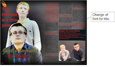
This is the first version which includes the important elements of a double page spread that are used to catch the readers eye. Things like the huge key image that takes over the whole first page, the bold first line that stands the article out, the inset images, and the bold glowing title. The problem here is to do with the poor variety of font.
Version 2:
The Second version of the double page spread gives a change in the font variety which involves bringing the font used to advertise the article on the front cover to the article. This is good as it gives a continuity from the cover to the article.
Version 3: Final
On the final version I added a line to end the article and I drew the photo back so that the page with text was white. To add the ending line I edited the text, I closed the lines together which made a more professional look and created space for more features.
This page is probably the best of my production however the photography could have been better and I could have used a greater variety of images.


No comments:
Post a Comment