Monday, 14 November 2011

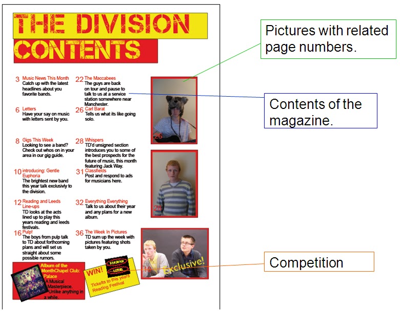
Contents Development and Final Analysis

This is the analysis of the development of my final Contents page.
Version 1:

The First contents page is quite bad. it shows some of the conventions like Competition sections and pictures with related page numbers. However it lacked a categorised contents and had a huge amount of dead space. This will begin to be corrected in version 2.

Version 2:

This version has smaller text in the story lines allowing space for more features, the problem was these features were not added and an increase in the the problem of dead space has come about.

Version 3: Final

This version saw the dead space filled which has meant that the page looks more professional and eye-catching. I have shown more conventions like the categorised contents and I have added features like the Subscription, Review and Website sections. This is the best version and shows the most conventions.

For the contents page I could have done better as the section feels rushed and defiantly the weakest of my areas. more time in planning and development was needed here.

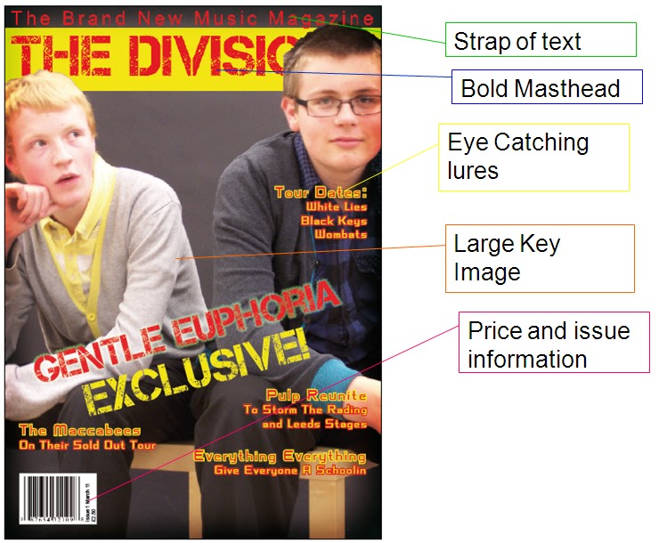
Front Cover Development and Final Analysis

This is the Development and final version of my front cover.
Version 1:

It Contains all of the codes and conventions from my research like Masthead, lures, barrcode and issue information. The problems are 

Version 2: 

This version involved rearranging the lures on the page to make space for a band list at the bottom which is another convention that can be seen in existing products. I have also varied the font for the main lure to create a more interesting look for the page.

Version 3: Final
The final edit saw the stroke removed as it improved the clarity of the text.

I think I could have improved my photography which is one of my weaker points as i had to have a re shoot and even after that some of my pictures could not be used. The improvement of my photos would have meant an overall better final piece as the cover would have been made more eye catching.

Saturday, 12 November 2011

Drafting

Using my research I have created drafts for each section.
Front cover:
                1                                2                                3


My draft work uses all the conventions of magazines like the strap of text across the top of the page, the masthead and lures described in my research and the large, eye-catching key image. I will use Draft 3 as the colours work better and was preferred by people who looked at them.

Contents:
              1                              2                                 3


These are my contents drafts and the also conform to most of the codes and conventions of magazine contents pages. They have the contents of the magazine, images with page number and competitions. However none feature categorised sections which i will need to incorporate in my actual production so I  conform to the codes and conventions of magazine contents pages.
The Draft I will use is 1 as it matches the colours of the chosen front cover, however I will use elements from the others like the album of the month section (Draft 2) as this will create a better contents page with more conventions.

Double Page Spread:
                          1                                               2


                                                   3
This is the draft work for my double page spread. They all contain large images that attract attention like what is shown in my research, they have "Exclusive" tags (Except 1) which will catch readers attention and have bright titles that also draw people to the article. I will be using draft 2 as the mid shot of the band was popular, the exclusive tag features and the "TD" fireball in the corner features which has a connotation of a "Hot" new popular act.

Wednesday, 9 November 2011

Double page spread research

This is some analysis of a double page spread from NME magazine


There are many conventions in the double page spread here. The first is the large key image that takes up a large amount of the page. This is a way of catching attention and drawing readers to the article. I will use this in my magazine production as it is seen widely in all magazines so I will conform to this convention.
The Body text starts with a large letter which I will also use in my development to draw the readers attention to the start of the article.

Monday, 7 November 2011

Contents research


This is some research that i have put together for the contents section of my magazine production.
The contents is probably the only section of the magazine that is looked at in the shop before the magazine is bought and for this reason it is crammed with information, pictures, subscription offers and competitions.
The reason for this is that the contents is responsible for giving the reader as much information as possible, off the shelf. If it does this well then the reader will likely buy the magazine so it is a pivotal component of the magazine.

The contents pages in magazines vary, some use more images, others more text (as seen in the image), but many share common features, they often use sections that the information is divided into, they all feature page numbers and many use a small image of the cover to advertise subscriptions or describe the cover story.

Mastheads and lures analysis

The main text elements of a front cover page are the masthead and the lures. here is some analysis of the masthead and lures from two major music magazines of different genres
1. Kerrang: Rock
2. The Source: Hip Hop/Rap


Lures play a huge part in selling the magazine as it makes people want to look inside, a well placed inset image also does this role but lures are seen more often than inset images as they feature in more magazines and are rarely left out. I will conform to the convention of lures in my magazine and may also feature inset images.
The Masthead is the key piece for magazine completion as they display the name of the magazine in the most bold and eye-catching ways. I will make sure to keep this bright in my magazine as it will need to catch potential readers attention.

From this research I have learned that I will need too use bright and bold, eye-catching lures and mastheads if I am to achieve a professional quality for my magazine.

Front cover analysis research

Here is a more in depth look at an existing product, examining the codes and conventions of a magazine in the genre of my choice, Alternative.


The front cover of NME conforms to the conventions shown in magazine covers of all genres. Things like the issue information and price are necessary for the sale of all magazines and conventions such as a bold masthead, large, striking key image and the use of lures are used to make the cover stand out to potential buyers.

The analysis of the NME cover will help in the development of my product as it has shown that i must conform to all the standard conventions of a music magazine. I will use these throughout, particularly on the front cover.